Brand Design for indieGlo
I don’t want to make you jealous, but I really have the best job ever. Actually I have the best clients which make this the best job. Ever.
I have women who share their dreams, goals, and mission with me and then trust me to translate them into authentic, attractive, meaningful brands. They are honest, brave, talented, and do so much good in the world that it’s my crazy pleasure to work with each and every one of them.
But I haven’t been very good about sharing that work with the rest of you. I’m a pretty private person, so to show off finished projects feels a little like, well, showing off. But it’s not about me. It’s about them. So if you’ve wondered what the “behind the scenes” looks like in the branding process, or if it really is all just artsy fartsy mumbo jumbo, then hop on in and take a look. This one’s a beauty, both the branding and the owner!
Avery is a certified health coach, with the unexpected background of also being an engineer, yoga teacher, and personal chef. Combine all that expertise together, and you get a strategic, intuitive, holistic coach who is passionate about helping her clients make incremental shifts that, over time, bring about sustainable change. The motto of her coaching practice, IndieGlo, is “Settle for More,” and that’s exactly what she’s all about. Whether clients are struggling to kick their sugar cravings or cope with an autoimmune disease, Avery’s individualized, fun approach helps them shift from feeling overwhelmed and hopeless to energized and empowered to make their own impact in the world.
So you can see why it was such a delight to take Avery’s new brand from her disappointing logo from Fiverr to something that encapsulated all of this goodness!

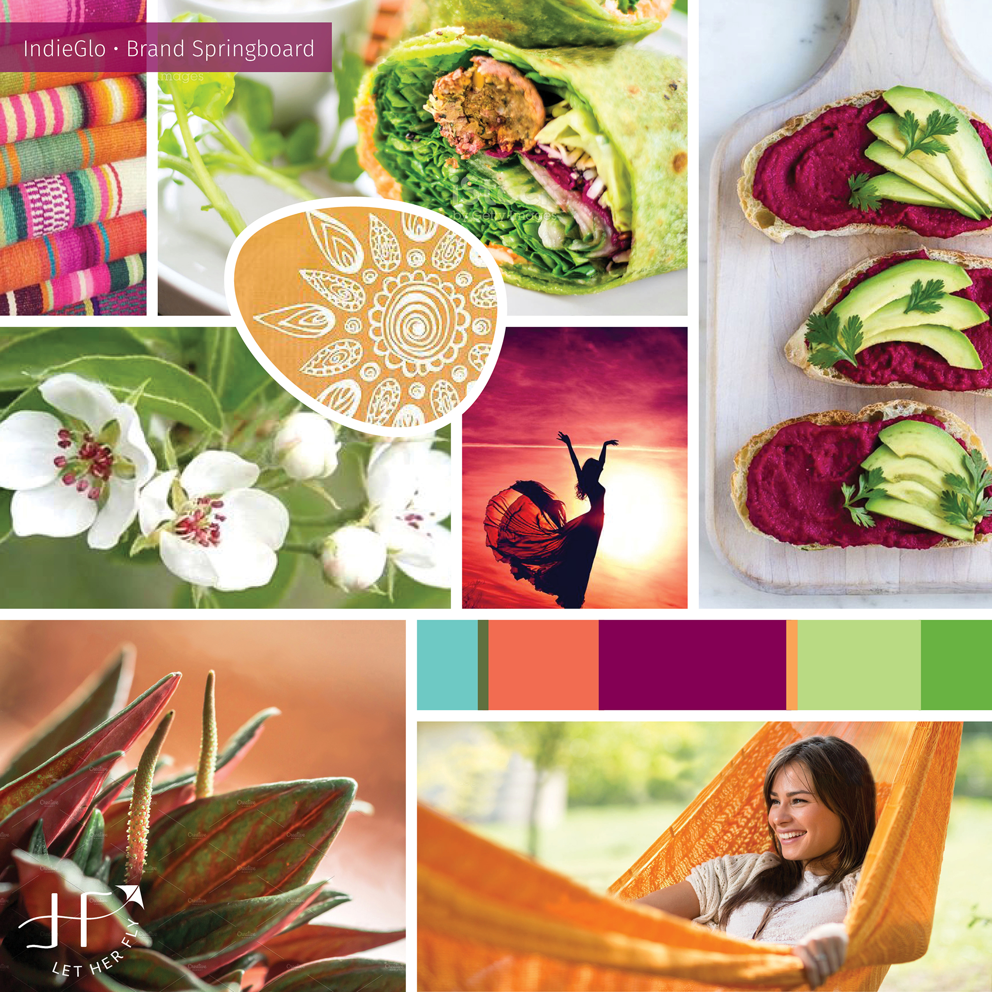
1 | Brand Summary & Springboard
So I’ll say it again that the most effective brands always starts by being INTENTIONAL — representing the heart of each business in a way that attracts the ideal clients. Standing out in today's competitive marketplace takes more than just "looking pretty.” Specific words and feelings are imperative to a strong foundation. A consultation, a questionnaire, and a Descriptive Word Bank help my clients define their business and their market, and Avery gave some of the most thoughtful, thorough answers I think I’ve ever heard.
In this beginning phase, I always create two critical pieces: a Brand Summary and Brand Springboard. The Brand Summary is literally a page of words and color psychology specific to each client’s business. This also becomes a handy reference tool for clients as they write and choose images for their brand long after we’ve finished the design process. The Brand Springboard (also known as an inspiration board or mood board) is a visual representation of the brand, full of imagery, type styles, and colors. I call it a "springboard" because it’s a critical jumping-off point that sets the tone for all the parts to come. Every piece finds its roots in these beginnings.
As I poured over Avery’s detailed feedback, I honed in on the keywords fresh, vibrant, confident and bohemian for her unique brand. In researching other health coaches, most had a very clean, crisp, white aesthetic, and that wouldn’t do for Avery. She has a bohemian air that sets her apart in her industry and something we wanted to capitalize on. I then expanded these keywords into other descriptors and feelings and chose colors that complement the keywords. Originally our primary colors were beet and green. Beet is a blend of red and purple representing strength, warmth, and action, and green is for harmony, balance, and restoration. As you’ll see later, we switched the green into a secondary brand color and embraced the papaya orange for more of a nurturing, exotic feel. You’ll find that we did a few course corrections throughout the branding process which made this one truly collaborative.
Often these two pieces go through a round of revisions or two to get everything just right. But Avery gave a very excited “I think you’ve nailed it!” with our first round. I never had to wonder what she was thinking. ;)
[A quick sidenote on collaboration]
I see a lot of discussion (thank you, Facebook) around “who is right – the designer or the client?” And if you hear nothing else, please hear this. Both are right. Both are experts. Both have invaluable input. The key is getting both parties to the table in an atmosphere of mutual respect and, dare I say, admiration. Collaboration is queen! The client has to trust her designer enough to be open and honest, and the designer must provide a safe place for those conversations, using her listening, intuition, God-given talent, and skill to discern the message behind the words. It’s not just about giving the client what she wants. It’s about helping each client understand what she really wants, what her clients want, and then translating that into the most effective solution.
2 | Logo
With her Brand Summary and Springboard heartily approved, I dug into designing her logo. There's lots of sketching and pencil-to-paper that happens behind the scenes, always keeping the Discovery words and visuals front and center. It's so important to get ideas on paper before jumping on the computer. Ideas flow quicker, and I can explore lots of options in a more intuitive way without getting bogged down and wasting time on details — yet. The details come later!
Several pages of sketches and ideas then get refined digitally for the client to see. The first round is presented in black and white so that the focus is on the integrity and effectiveness of the design, not the individual colours. It's so easy to get bogged down in color selection while neglecting the basic structure and message of the logo itself.

However, I won’t show you indieGlo's first round of logo designs because, well, they didn’t leave Avery as thrilled and the Springboard did. I could tell by her hesitation that I had missed the mark. I had focused more on the fresh, vibrant feel while she was envisioning something more bohemian and natural.
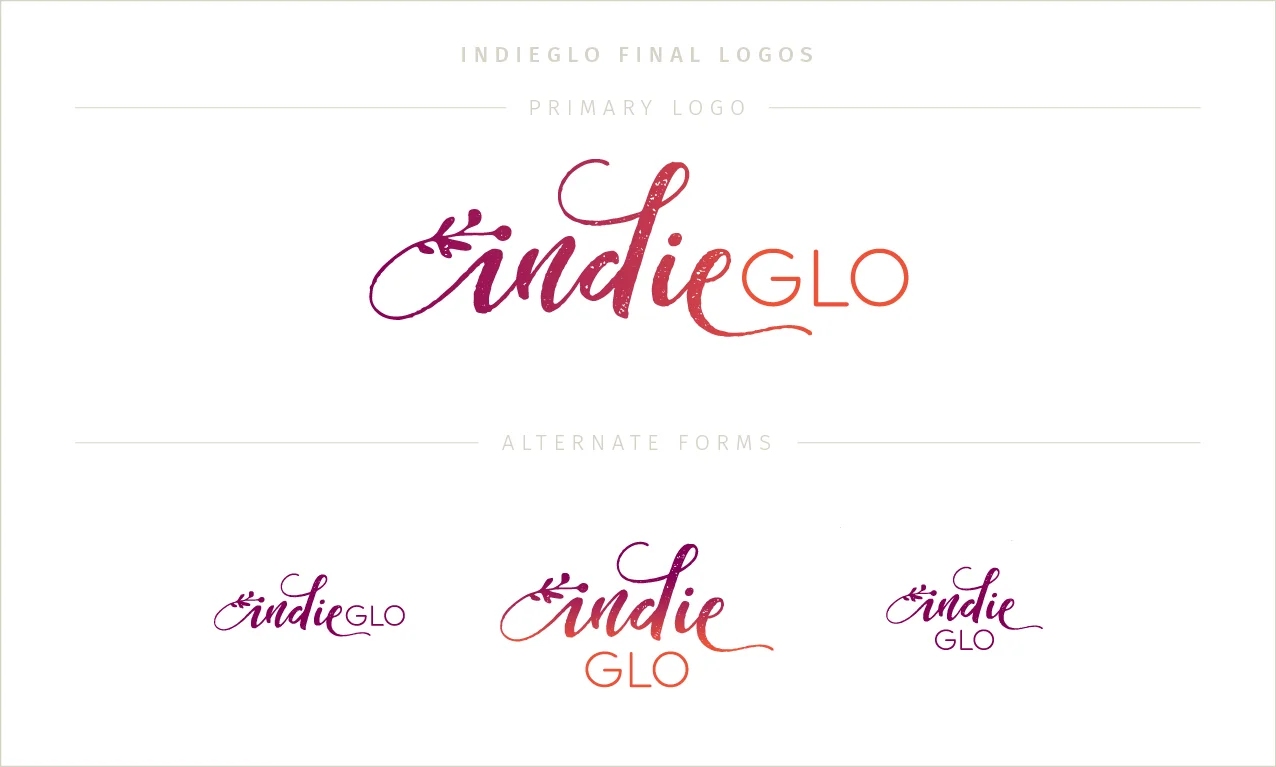
In light of a recent conversation with a designer friend of mine, I want to be very transparent about this. My friend had the same experience recently with a client. They weren’t happy with the first logos either, and my friend was feeling like a bit of a failure even though the final logo was a huge success. She was encouraged to know that this happens to others too. It isn’t a failure or flop. It’s always a learning experience and a chance to grow and expand into something better. And expand we both did. After a trip back to the drawing board, I found a better solution, one that aligned with what she had in mind. Her final version incorporates the undercurrents of growth, food, movement, and vitality while keeping with a softer, rustic texture. The warmth and vibrance of the beet-to-orange gradation was the perfect finishing touch. It got lots of tweaks, adjustments, and polishing to get it just right. Alternate logo formats, specific colors, and the favicon quickly followed.
3 | Brand Board
Her final Brand Board pulls together all her branding elements in one handy location. My goal is to make using new branding as easy as possible for my clients, so having everything in one place is a must. Clients also receive a Brand Style Guide — a comprehensive pdf that outlines the “do’s” and “don'ts” of how to implement their branding, consistently and simply. Having all these pieces in place, Suzy was able to incorporate them into her existing website and create guides and materials for her clients.

4 | Collateral pieces
Thank you cards, business cards, and a fun set of icons were also part of the design process. When I design pieces that are meant to be printed, my clients also receive detailed printing instructions so there’s no headache, questions, or wasted time.

Since she first launched indieGlo, Avery has pivoted her business into a new niche without changing her business name or visual branding—proof that the investment into thoughtful branding can last for years and through many business iterations!
If you’re curious what my Signature Brand Package would look like for you, book a free consultation here. I’d love to show you how I can help you look like the pro you are so you can grow your business with confidence.

When I was finally ready to invest in professional branding, I knew that I wanted a designer who would work collaboratively and create a brand that communicated the values and passion that fuel my coaching practice.
I felt like I was your single most important client and that you were dedicated to doing your best work in order to get my branding done “just right" and on schedule.
Thank you SO MUCH for your professionalism, for sharing your talents and skills, and for your caring guidance and encouragement every step of the way. I LOVED working with you, and I’m so THRILLED with the final result!
— Avery Belle Stone, indieGlo