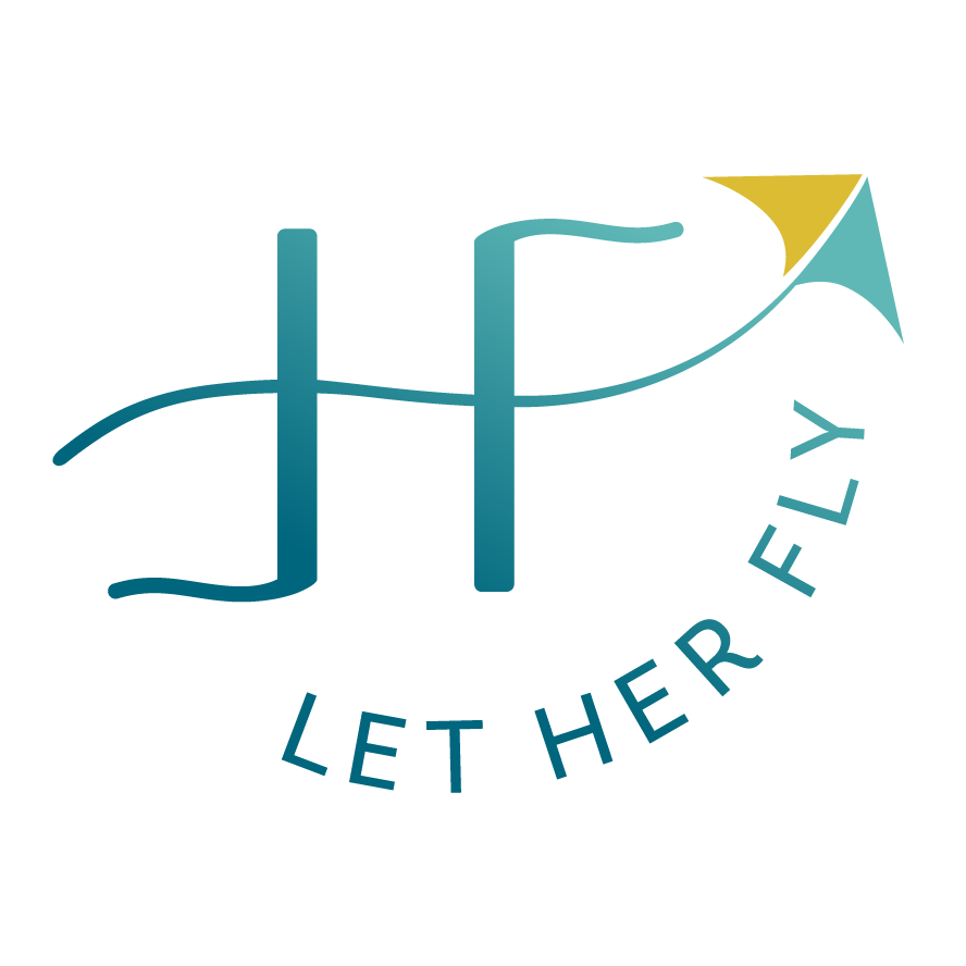
Branding for indieGlo
Avery is a certified health coach, with the unexpected background of also being an engineer, yoga teacher, and personal chef. Combine all that expertise together, and you get a strategic, intuitive, holistic coach who is passionate about helping her clients make incremental shifts that, over time, bring about sustainable change. The motto of her coaching practice, IndieGlo, is “settle for more,” and that’s exactly what she’s all about. Whether clients are struggling to kick their sugar cravings or cope with an autoimmune disease, Avery’s individualized, fun approach helps them shift from feeling overwhelmed and hopeless to energized and empowered to make their own impact in the world.
So you can see why it was such a delight to take Avery’s new brand from her disappointing logo from Fiverr to something that encapsulated all of this goodness!
As I poured over Avery’s detailed feedback from our consultation and her worksheets, I honed in on the keywords fresh, vibrant, confident and bohemian for her unique brand. She has a bohemian air to her that is definitely a differentiator in her industry and something we wanted to capitalize on. Originally our primary colors were beet and green. Beet is a blend of red and purple representing strength, warmth, and action, and green is for harmony, balance, and restoration. As you can see, we switched the green into a secondary brand color and embraced the papaya orange for more of a nurturing, energetic, exotic feel.
With her Brand Strategy heartily approved, I dug into designing indieGlo’s new logo. Her final version incorporates the undercurrents of growth, food, and movement, while keeping with a softer, rustic texture. The warmth and vibrance of the beet-to-orange gradation was the perfect finishing touch. It got lots of tweaks, adjustments, and polishing to get it just right. Alternate logo formats, specific colors, and the favicon quickly followed.
Her final Brand Board is the perfect quick reference for all her branding elements. A comprehensive Brand Style Guide outlines the “dos” and “don’ts” of how to implement her branding, consistently and simply. Thank you cards, business cards, and a fun set of icons were also part of the design process. My clients also receive detailed printing instructions so there’s no headache, questions, or wasted time. Having all these pieces in place, Avery was able to customize her existing website, create guides and materials for her clients, and get her business cards and thank you cards printed quickly and easily.
She has since been able to pivot her business into a new niche without changing her business name or visual branding—proof that thoughtful branding can last for years and through many business iterations! Well done, Avery!
You can read the details of the complete design process for indieGlo on the blog here.

When I was finally ready to invest in professional branding, I knew that I wanted a designer who would work collaboratively and create a brand that communicated the values and passion that fuels my coaching practice.
I felt like I was your single most important client and that you were dedicated to doing your best work in order to get my branding done “just right" and on schedule.
Thank you SO MUCH for your professionalism, for sharing your talents and skills, and for your caring guidance and encouragement every step of the way. I LOVED working with you, and I’m so THRILLED with the final result!


Return to Portfolio